
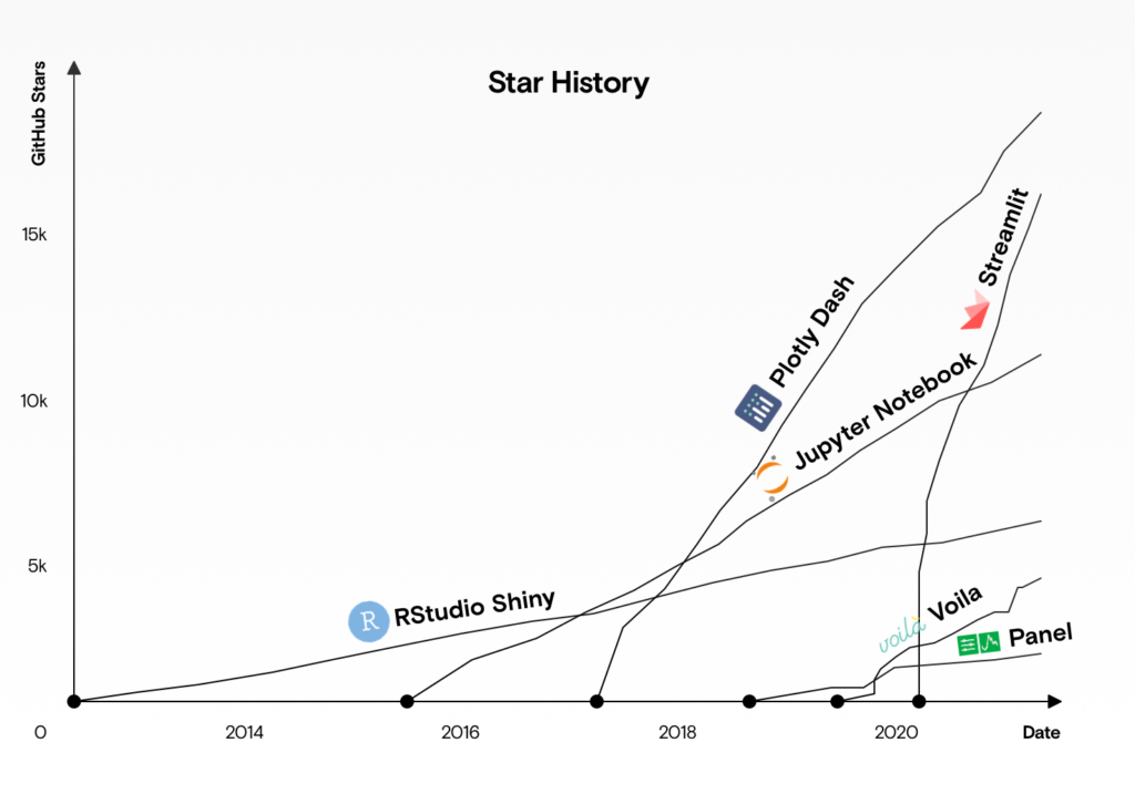
Streamlit is an open-source Python framework for creating interactive dashboards. Currently, the most popular framework seems to be Dash, but as the graph below shows, Streamlit’s popularity on Github has been growing rapidly since 2020.
Although Streamlit has the disadvantage of not allowing detailed visual customization like Dash, it allows us to easily create a dashboard if you can accept some default settings. In this article, I will explain the process of creating a dashboard to visualize a Kaggle dataset using Streamlit and Plotly.
The code presented in this article is available in the GitHub Repository here.
Dataset and Dashboard
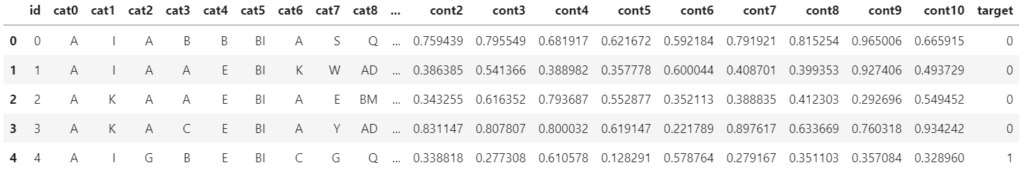
In this case, we will use data from Kaggle’s tabular playground series Mar 2021. This data includes id, 19 categorical variables: cat0 – cat18, 11 continuous variables: cont0 – cont10, and a binary (0,1) target variable as shown in the table below.
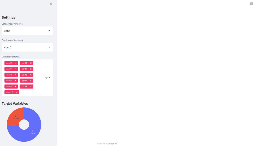
The goal is to create the following dashboard with the sidebar section on the left and the content section on the right.
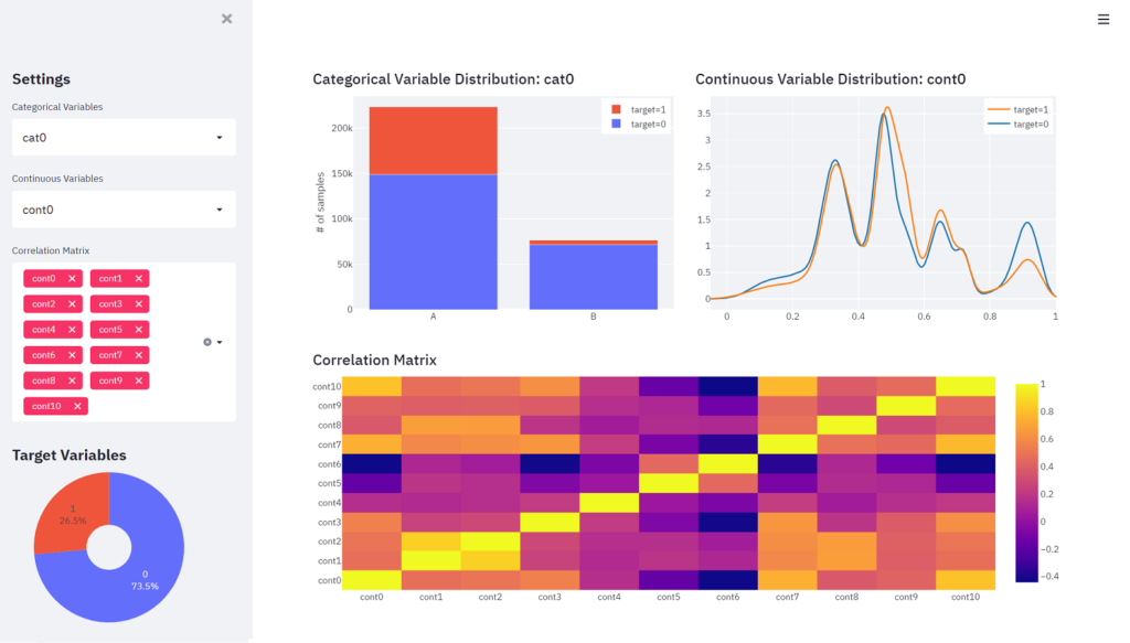
The left sidebar section displays three drop-down lists. The first two drop-down lists select one categorical variable and one continuous variable, respectively. The distribution of the variables selected in those drop-down lists is displayed at the top of the right content section. The third drop-down list allows you to select multiple continuous variables, and a correlation matrix heat map between the selected variables is displayed at the bottom of the content section. At the bottom of the sidebar, a pie chart is placed to see the percentage of the target variable.
Installing Libraries
First, install Streamlit and Plotly.
conda install -c conda-forge streamlitconda install -c plotly plotlyThen, import the required modules.
import pandas as pd
import plotly.figure_factory as ff
import plotly.graph_objects as go
import streamlit as st
Next, load the data to be used and create a list of column names for categorical and continuous variables.
df = pd.read_csv('data/data_sample.csv')
vars_cat = [var for var in df.columns if var.startswith('cat')]
vars_cont = [var for var in df.columns if var.startswith('cont')]
Creating Components of the Sidebar Section
First, set up the following to avoid unnecessary white space on both sides of the screen.
st.set_page_config(layout="wide")The following components are required for the sidebar section.
- “Settings” in bold and in the size of Heading 2
- Drop-down list for selecting the categorical variable
- Drop-down list for selecting the continuous variable
- Multiselected drop-down list for selecting continuous variables
- “Target Variables” in bold and in the size of Heading 2
- Pie chart displaying the percentage of the target variable
These are expressed in Streamlit as Layout (sidebar) part in the following code. Streamlit makes it easy to add dashboard components by simply coding st + method name. The top half of the code below is for creating the pie chart.
# Graph (Pie Chart in Sidebar)
df_target = df[['id', 'target']].groupby('target').count() / len(df)
fig_target = go.Figure(data=[go.Pie(labels=df_target.index,
                                    values=df_target['id'],
                                    hole=.3)])
fig_target.update_layout(showlegend=False,
                         height=200,
                         margin={'l': 20, 'r': 60, 't': 0, 'b': 0})
fig_target.update_traces(textposition='inside', textinfo='label+percent')

# Layout (Sidebar)
st.markdown("## Settings")
cat_selected = st.selectbox('Categorical Variables', vars_cat)
cont_selected = st.selectbox('Continuous Variables', vars_cont)
cont_multi_selected = st.multiselect('Correlation Matrix', vars_cont,
                                     default=vars_cont)
st.markdown("## Target Variables")
st.plotly_chart(fig_target, use_container_width=True)
Each Streamlit method has the following roles.
- st.markdown: Display strings according to markdown notation
- st.selectbox: Display the drop-down. The first argument sets the title and the second setst the list of choices
- st.multiselect: Display the multiselected drop-down. The first two arguments are the same as for st.selectbox. The third argument sets an initial values.
- st.plotly_chart: Display the pie chart with Plotly. If the argument is True, set the chart width to the column width (In this case, sidebar width).
The items selected in the drop-down list are used in the following step, so assign them to the variables: cat_selected, cont_selected, and cont_multi_selected, respectively.
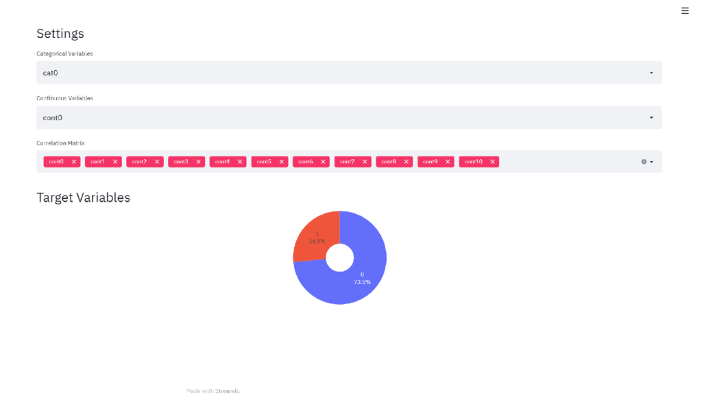
Save the codes above in app.py and execute streamlit run app.py on the terminal, and the following screen will appear in your browser.
Layout of the Sidebar Section
To display the component created in the previous section as a sidebar, just add “sidebar” between st and the method name.
# Layout (Sidebar)
st.sidebar.markdown("## Settings")
cat_selected = st.sidebar.selectbox('Categorical Variables', vars_cat)
cont_selected = st.sidebar.selectbox('Continuous Variables', vars_cont)
cont_multi_selected = st.sidebar.multiselect('Correlation Matrix', vars_cont,
                                             default=vars_cont)
st.sidebar.markdown("## Target Variables")
st.sidebar.plotly_chart(fig_target, use_container_width=True)
When the code is changed, “Rerun” button will appear in the upper right corner of the browser, and pressing that button will refresh the screen.
The sidebar is easily created.
Creating Graphs of the Content Section
Create graphs with Plotly to be displayed in the content section.
# Categorical Variable Bar Chart in Content
df_cat = df.groupby([cat_selected, 'target']).count()[['id']].reset_index()

cat0 = df_cat[df_cat['target'] == 0]
cat1 = df_cat[df_cat['target'] == 1]

fig_cat = go.Figure(data=[
    go.Bar(name='target=0', x=cat0[cat_selected], y=cat0['id']),
    go.Bar(name='target=1', x=cat1[cat_selected], y=cat1['id'])
])

fig_cat.update_layout(height=300,
                      width=500,
                      margin={'l': 20, 'r': 20, 't': 0, 'b': 0},
                      legend=dict(
                          yanchor="top",
                          y=0.99,
                          xanchor="right",
                          x=0.99),
                      barmode='stack')
fig_cat.update_xaxes(title_text=None)
fig_cat.update_yaxes(title_text='# of samples')

# Continuous Variable Distribution in Content
li_cont0 = df[df['target'] == 0][cont_selected].values.tolist()
li_cont1 = df[df['target'] == 1][cont_selected].values.tolist()

cont_data = [li_cont0, li_cont1]
group_labels = ['target=0', 'target=1']

fig_cont = ff.create_distplot(cont_data, group_labels,
                              show_hist=False,
                              show_rug=False)
fig_cont.update_layout(height=300,
                       width=500,
                       margin={'l': 20, 'r': 20, 't': 0, 'b': 0},
                       legend=dict(
                           yanchor="top",
                           y=0.99,
                           xanchor="right",
                           x=0.99)
                       )

# Correlation Matrix in Content
df_corr = df[cont_multi_selected].corr()
fig_corr = go.Figure([go.Heatmap(z=df_corr.values,
                                 x=df_corr.index.values,
                                 y=df_corr.columns.values)])
fig_corr.update_layout(height=300,
                       width=1000,
                       margin={'l': 20, 'r': 20, 't': 0, 'b': 0})
Now that we have assigned fig_cat, fig_cont, fig_corr to the graphs to be displayed in the contents, we will set up the layout in the next section. The height, width, and margins of the graphs are adjusted using Plotly’s update_layout method so that the graphs fit on the screen.
Layout of the Content Section
Steamlit allows us to set the number of columns to divide the entire screen vertically. In this case, the number of columns is set to 2 since the distribution of categorical and continuous variables are arranged side by side at the top of the content. Also, set the variables for the components to be placed in the left and right columns to left_column and right_column, respectively.
left_column, right_column = st.columns(2)The components to be displayed in the content section are as follows.
- Distribution of the categorical variable title and body (Top right)
- Distribution of the categorical variable title and body (Top left)
- Heatmap of the correlation matrix (Bottom)
These are expressed in Streamlit as the following code.
left_column.subheader('Categorical Variable Distribution: ' + cat_selected)
right_column.subheader('Continuous Variable Distribution: ' + cont_selected)
left_column.plotly_chart(fig_cat)
right_column.plotly_chart(fig_cont)
st.subheader('Correlation Matrix')
st.plotly_chart(fig_corr)
The entire code is as follows.
import pandas as pd
import plotly.figure_factory as ff
import plotly.graph_objects as go
import streamlit as st
st.set_page_config(layout="wide")
# Data
df = pd.read_csv('data/data_sample.csv')
vars_cat = [var for var in df.columns if var.startswith('cat')]
vars_cont = [var for var in df.columns if var.startswith('cont')]
# Graph (Pie Chart in Sidebar)
df_target = df[['id', 'target']].groupby('target').count() / len(df)
fig_target = go.Figure(data=[go.Pie(labels=df_target.index,
values=df_target['id'],
hole=.3)])
fig_target.update_layout(showlegend=False,
height=200,
margin={'l': 20, 'r': 60, 't': 0, 'b': 0})
fig_target.update_traces(textposition='inside', textinfo='label+percent')
# Layout (Sidebar)
st.sidebar.markdown("## Settings")
cat_selected = st.sidebar.selectbox('Categorical Variables', vars_cat)
cont_selected = st.sidebar.selectbox('Continuous Variables', vars_cont)
cont_multi_selected = st.sidebar.multiselect('Correlation Matrix', vars_cont,
default=vars_cont)
st.sidebar.markdown("## Target Variables")
st.sidebar.plotly_chart(fig_target, use_container_width=True)
# Categorical Variable Bar Chart in Content
df_cat = df.groupby([cat_selected, 'target']).count()[['id']].reset_index()
cat0 = df_cat[df_cat['target'] == 0]
cat1 = df_cat[df_cat['target'] == 1]
fig_cat = go.Figure(data=[
go.Bar(name='target=0', x=cat0[cat_selected], y=cat0['id']),
go.Bar(name='target=1', x=cat1[cat_selected], y=cat1['id'])
])
fig_cat.update_layout(height=300,
width=500,
margin={'l': 20, 'r': 20, 't': 0, 'b': 0},
legend=dict(
yanchor="top",
y=0.99,
xanchor="right",
x=0.99),
barmode='stack')
fig_cat.update_xaxes(title_text=None)
fig_cat.update_yaxes(title_text='# of samples')
# Continuous Variable Distribution in Content
li_cont0 = df[df['target'] == 0][cont_selected].values.tolist()
li_cont1 = df[df['target'] == 1][cont_selected].values.tolist()
cont_data = [li_cont0, li_cont1]
group_labels = ['target=0', 'target=1']
fig_cont = ff.create_distplot(cont_data, group_labels,
show_hist=False,
show_rug=False)
fig_cont.update_layout(height=300,
width=500,
margin={'l': 20, 'r': 20, 't': 0, 'b': 0},
legend=dict(
yanchor="top",
y=0.99,
xanchor="right",
x=0.99)
)
# Correlation Matrix in Content
df_corr = df[cont_multi_selected].corr()
fig_corr = go.Figure([go.Heatmap(z=df_corr.values,
x=df_corr.index.values,
y=df_corr.columns.values)])
fig_corr.update_layout(height=300,
width=1000,
margin={'l': 20, 'r': 20, 't': 0, 'b': 0})
# Layout (Content)
left_column, right_column = st.columns(2)
left_column.subheader('Categorical Variable Distribution: ' + cat_selected)
right_column.subheader('Continuous Variable Distribution: ' + cont_selected)
left_column.plotly_chart(fig_cat)
right_column.plotly_chart(fig_cont)
st.subheader('Correlation Matrix')
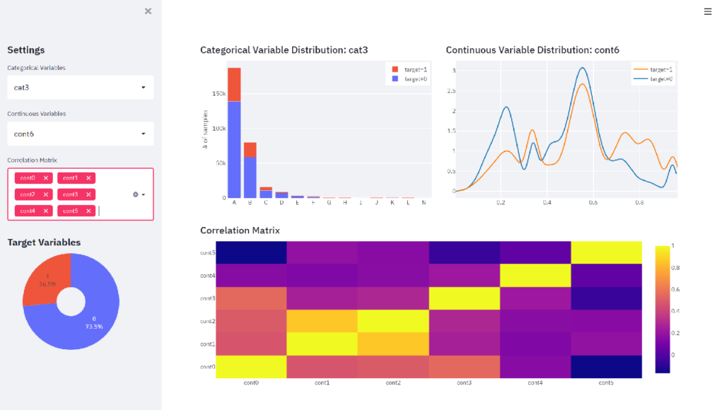
st.plotly_chart(fig_corr)Press the Rerun button on the browser and select cat3 as categorical variable, cont6 as continuous variable, and cont0 – cont5 for the correlation matrix, and the dashboard will change as follows.
Conclusion
Now, we have the interactive dashboard. Although Streamlit does not allow for detailed visual customization, we found that when combined with Plotly, it is very easy to create a good-looking dashboard with a minimum of coding. The Streamlit community will gradually add more features in the future, so this will be a powerful tool for analysts who want to spend more time on the logic part while keeping the coding of creating dashboards minimal.
The dashboard in this article is available here using Streamlit Sharing.
If you want to create dashboards with Streamlit and Altair, check out this article.


コメント