
Altair, a Python visualization library, allows you to create not only basic graphs but also specify data aggregation methods in the process of creating graphs and to easily draw interactive graphs. In this article, I will explain the basic usage of Altair and its useful applications such as aggregate data visualization and interactive graphs.
Install Libraries and Datasets
Install Altair and Vega_datasets using pip or Conda.
pip install altair vega_datasetsconda install -c conda-forge altair vega_datasetsImport the required modules and load the cars dataset.
import altair as alt
from vega_datasets import data
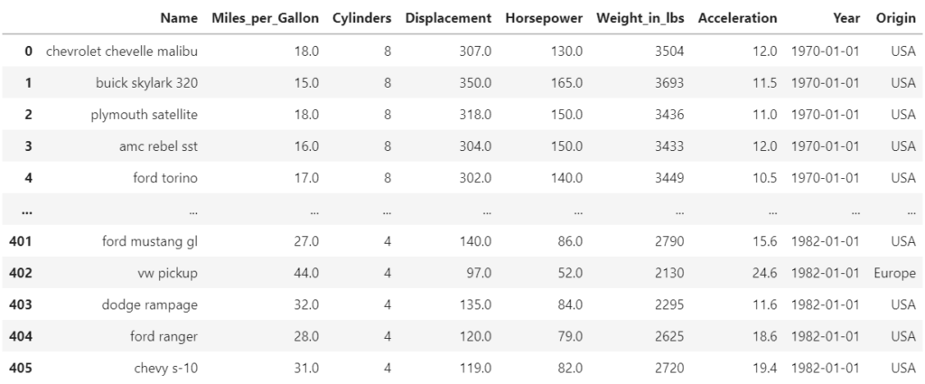
source = data.cars()The cars dataset is a dataset that stores horsepower, displacement, etc. of automobiles as shown below.
Basic Usage
First, specify the data to be used in alt.Chart() in Pandas Dataframe format, followed by the type of chart. The following example specifies mark_circle for a scatter plot, but various other types can be specified as follows.
- Scatter Plot:mark_circle
- Bar Chart:mark_bar
- Line Chart:mark_line
You can see how to create various types of graphs in Example Gallery.
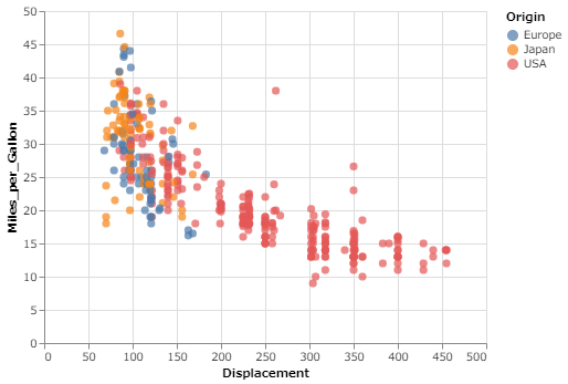
In encode() method, specify the data for the x-axis and y-axis, and if you want to separate colors for each attribute of the data, specify the attribute data in the coler argument. Here, Displacement is specified on the x-axis, Miles_per_Gallon on the y-axis, and the color argument is set to Origin. The width and height of the graph can be specified in properties.
alt.Chart(source).mark_circle(size=50).encode(
    x='Displacement',
    y='Miles_per_Gallon',
    color='Origin'
).properties(
    width=400, height=300)
Executing the above code will create the graph below. This is the basic usage.

Plot Aggregated Results
Aggregate by group
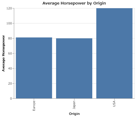
Next, use transform_aggregate to plot the average Horsepower per Origin in a bar chart. In transform_aggregate, define a new variable avg_hp to store the mean value, specify ‘mean(Horsepower):Q’ there, and specify the column Origin in the groupby argument. Simply do this to create a bar chart that aggregates the average Horsepower for each region. Changing “mean” to “median” or “max” will also output the median or maximum value.
alt.Chart(source).mark_bar().encode(
x='Origin:N',
y=alt.Y('avg_hp:Q', title='Average Horsepower')
).transform_aggregate(
avg_hp='mean(Horsepower):Q', groupby=['Origin']
).properties(
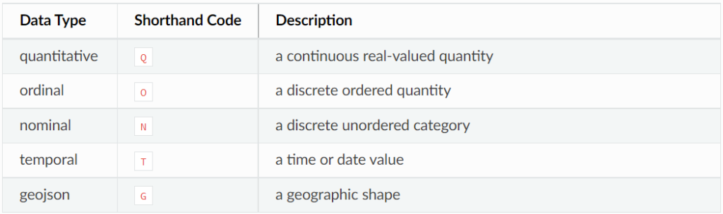
width=400, height=300, title='Average Horsepower by Origin')Here, Q in ‘mean(Horsepower):Q’ represents quantitative data of continuous type. The type specified in the Dataframe used will be recognized by Altair as it is, but if Altair cannot recognize the type, such as newly defined data, an error may occur or Q or N in the table below may be automatically specified. If you have trouble creating a graph, specify the data type based on the table below.
In the above code, the label for the y-axis is specified as “Average Horsepower” using the title argument of the alt.Y() method(the first argument is the column name of the DataFrame). To specify the title of the graph, use the title argument in properties. Executing the above code will create the bar chart below.
Aggregate Time-Series Data
This section explains how to create a graph showing daily time-series data aggregated by month. The Year column contains dates in the form yyyy-mm-dd, which can be converted to monthly dates by specifying ‘yearmonth(Year):T’ for the x-axis (T represents the date type, as shown in the table above). Then, by setting the y-axis to ‘mean(Miles_per_Gallon):Q’, the monthly average is calculated.
alt.Chart(source).mark_line(
).encode(
    x=alt.X('yearmonth(Year):T', title='Date'),
    y=alt.Y('mean(Miles_per_Gallon):Q', title='Average Miles per Gallon'),
    color='Origin:N'
).properties(
    width=400, height=300)
Executing the above code will create the line chart below.
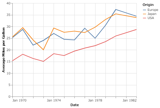
Setting the x-axis to ‘year(Year):T’ produces a time-series plot of average values by year, and setting ‘month(Year):T’ produces a graph of average values aggregated from January to December.
Interactive Plots
Next, set up the graph so that it can be interactively manipulated.
selection
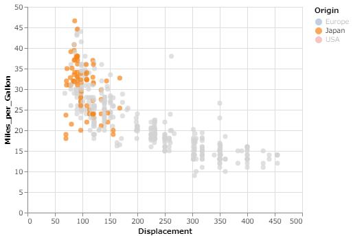
We add interactivity to the first scatter plot we created above. Here we set it so that when you click on one of the group names in the legend, only that group will remain in color, while the other groups will change color to lightgrey. As shown in the following code, alt.selection_multi method specifies the group to be used for the legend, and alt.condition method specifies how the color will be changed and stored in the selection and color variables, respectively.
Then add them to the encode and the newly set add_selection method.
selection = alt.selection_multi(fields=['Origin'], bind='legend')
color = alt.condition(selection,
                      alt.Color('Origin:N'),
                      alt.value('lightgray'))

alt.Chart(source).mark_circle(size=50).encode(
    x='Displacement:Q',
    y='Miles_per_Gallon:Q',
    color=color
).properties(
    width=400, height=300
).add_selection(selection)
Executing the above code will create the scatter plot below.
After the graph is created, if you click near Japan in the legend, only the data for Japan will remain in color and the data for other regions will be light grey. Multiple groups can also be selected by shift+clicking.
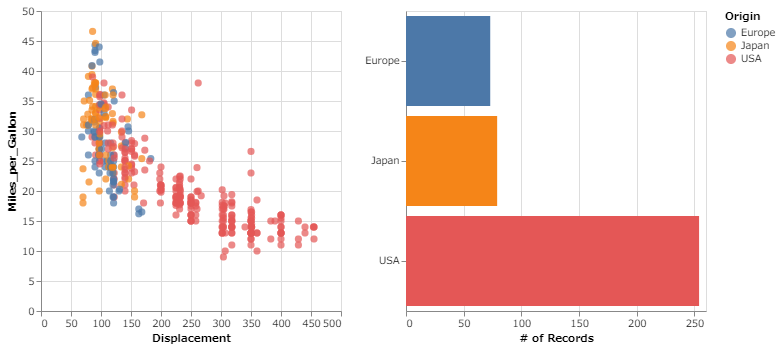
brush
Next, add a feature called “brush” that performs an interactive operation on the data in the range selected by the cursor. Here, multiple graphs are created. One is the same scatter plot as the example above, and the other is a bar chart showing the number of data per origin. The scatter plot leaves color only in the selected range, and the bar chart is set to vary with the number of data in the range selected in the scatter plot.
To specify the brush for interactive operations, use the selection_interval method. The color variable is the same as in the previous example because it is lightgrey except for the selected group. The code for the scatter plot is almost the same as the previous one, but add_selection method is set to brush. For the bar chart, brush is set in transform_filter to display the number of data in the selected range for the scatter plots. Also, here the common parts of the two graphs are stored in the base variable, which is then used in the points variable for the scatter plot and the bars variable for the bar graph. Use hconcat to arrange multiple graphs horizontally (vconcat to arrange them vertically).
brush = alt.selection_interval()
color = alt.condition(brush,
                      alt.Color('Origin:N'),
                      alt.value('lightgray'))

base = alt.Chart(source).properties(width=300, height=300)
points = base.mark_circle(size=50).encode(
    x='Displacement:Q',
    y='Miles_per_Gallon:Q',
    color=color
).add_selection(
    brush
)
bars = base.mark_bar().encode(
    x=alt.X('count(Origin):Q', title='# of Records'),
    y=alt.Y('Origin:N', title=''),
    color='Origin:N'
).transform_filter(
    brush
)

alt.hconcat(points, bars)
Executing the above code will create the scatter plot and bar chart below.
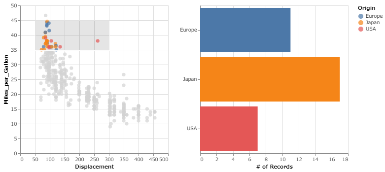
Next, select the 35-45 range for Miles_per_Gallon and the 50-300 range for Displacement on the scatter plot. Then, only the selected range will remain colored in the scatter plot, and the bar chart will change to the number of data contained in the range selected in the scatter plot.
Conclusion
This is all that is needed to add interactivity. Once you get used to writing code, Altair is very intuitive and beautifully draws a variety of graphs, so it is a library that I would like to investigate other useful uses for and continue to use in the future.
If you want to create dashboards with Streamlit and Altair, check out this article.


コメント