
Plotly is a visualization library for creating interactive graphs developed by the Canadian company Plotly. Plotly can perform exploratory data analysis and it can be combined with Dash, the company’s framework for web application development, to create dashboards that provide advanced visualization.
Plotly is used for a wide range of purposes, from basic to advanced, but because of its various modules, there are multiple ways to create a bar chart, for example. In this article, I will explain how to select the module to be used for each application based on the official Plotly website.
How to select the module
Plotly has three modules: Plotly Express, Graph Objects, and Figure Factory. Plotly Express is the easiest and requires the least amount of code to draw graphs, so the official Plotly website recommends using Plotly Express to create what can be created. While Graph Objects actually runs internally, Plotly Express is a high-level wrapper that requires far less coding than Graph Objects to create a graph and a basic graph can be created by simply calling a single function (px.bar for a bar graph). So when do you use Graph Objects? Graph Objects is used to create specific graphs in three dimensions that are not implemented in Plotly Express, or when detailed settings are required, such as creating subplots or dual-axis plots with a mixture of various types of graphs. Finally, what about Figure Factory? Some graphs are quite special and can only be created in Figure Factory, so it is used to create these graphs. Figure Factory items that can now be created in Plotly Express are considered “legacy” and are deprecated. (Here is a list of graphs that can be created with Figure Factory and that fall under the “legacy” category)
Plotly Express
Basic Usage
The first choice is Plotly Express because it offers the most simple coding. Import modules conventionally as follows.
import plotly.express as exIf you want to create a single basic graph, such as a bar or line chart, you can use Plotly Express. To illustrate the procedure for creating a graph, consider the following simple data frame, following Plotly’s official website. This data represents the number of pieces of fruit eaten by each participant in a gluttony-like contest.
import pandas as pd
df = pd.DataFrame({
"Fruit": ["Apples", "Oranges", "Bananas", "Apples", "Oranges", "Bananas"],
"Contestant": ["Alex", "Alex", "Alex", "Jordan", "Jordan", "Jordan"],
"Number Eaten": [2, 1, 3, 1, 3, 2],
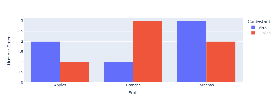
})For example, in the case of a bar graph, a graph can be created by simply setting a few arguments to the bar function as follows. In this case, a bar graph is created with the horizontal axis representing the type of fruit and the vertical axis representing the number of pieces of each fruit eaten by each participant. This graph is also color-coded for each participant.
fig = px.bar(df, x="Fruit", y="Number Eaten", color="Contestant", barmode="group")Execute fig.show() to display the figure below.
We have found that Plotly Express makes it easy to create graphs with a single line of code.
Facet
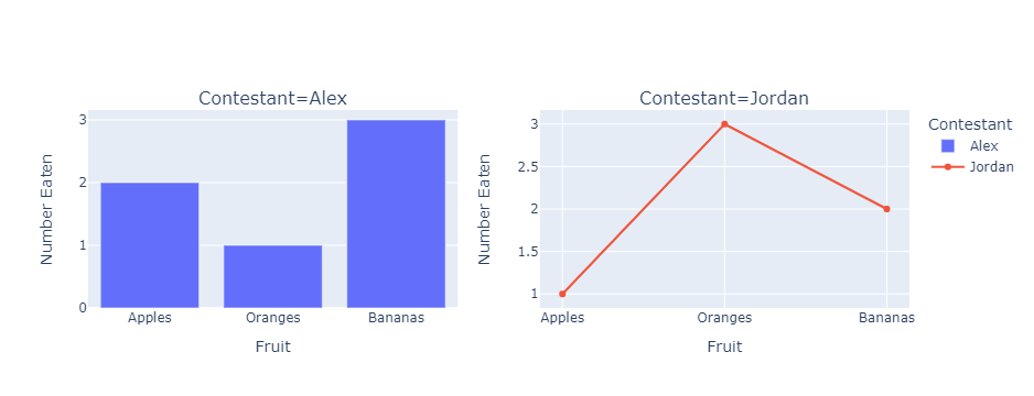
To create multiple graphs by dividing data by category, use a facet function. Here we create a bar graph of the number of pieces of each fruit eaten by each participant (Two bar graphs for Alex and Jordan). To arrange the graph horizontally for each participant, specify the column name contestant in the facet_col argument. To arrange the graph vertically, use facet_row to specify the column name. To arrange graphs of two categories in a grid, specify both arguments.
fig = px.bar(df, x="Fruit", y="Number Eaten", color="Contestant", facet_col="Contestant")Execute fig.show() to display the figure below.

Now we know the basic usage of Plotly Express and how to create multiple graphs. The next chapter shows the basic usage of Graph Objects and how to create multiple graphs with Graph Objects and compares it to the Plotly Express graphing process.
Graph Objects
Basic Usage
Here is the process for the same bar chart created in the previous section with Graph Objects. First, import the module as follows, as is customary.
import plotly.graph_objects as goThe code to create the graph is as follows.
# Creation of Drawing Area
fig = go.Figure()

df1 = df[df['Contestant']=='Alex']
df2 = df[df['Contestant']=='Jordan']

# Adding Traces
fig.add_trace(go.Bar(x=df1["Fruit"], y=df1["Number Eaten"], name='Alex'))
fig.add_trace(go.Bar(x=df2["Fruit"], y=df2["Number Eaten"], name='Jordan'))

# Style Adjustments
fig.update_layout(legend_title_text = "Contestant")
fig.update_xaxes(title_text="Fruit")
fig.update_yaxes(title_text="Number Eaten")
We can confirm that the same graph is created by executing fig.show().

A glance at the code reveals that it is longer than that of Plotly Express. Creating a graph with Graph Objects consists of the following three steps.
- Create a drawing area with an empty figure by Figure()
- Add a trace, a graph entity, to the drawing area with the add_trace()
- Adjust graph style with update_layout, etc.
Plotly Express runs Graph Objects internally, so we can create complete graphs without having to specify details. However, when using Graph Objects directly, you must explicitly specify the drawing area, the definition of the graph for each participant, as well as the legend and axis titles to be reflected in the graph. This is why the official Plotly website recommends using Plotly Express when creating simple graphs.
Also, although the graphs look exactly the same, Plotly Express is easier to understand what is displayed when you hover the cursor over the graph, and you will need to write more complex code to match the graphs to that point. (If you are interested in more details, please refer to the official Plotly website.)
Subplots
So when should Graph Objects be used? In the previous section, facets were used to create bar charts for the number of each fruit eaten by Alex and Jordan, respectively. If we want to change only Jordan’s graph to a line chart, Plotly Express does not allow us to do so easily. In this case, Graph Objects and subplots module are used together.
Import the make_subplots function from the subplots module.
from plotly.subplots import make_subplotsTo make only Jordan’s graph a line chart, the code would look like this.
# Creation of 1×2 Drawing Area
fig = make_subplots(rows=1, cols=2, subplot_titles=['Contestant=Alex', 'Contestant=Jordan'])

df1 = df[df['Contestant']=='Alex']
df2 = df[df['Contestant']=='Jordan']

# Adding Traces
fig.add_trace(go.Bar(x=df1["Fruit"], y=df1["Number Eaten"], name='Alex'), row=1, col=1)
fig.add_trace(go.Scatter(x=df2["Fruit"], y=df2["Number Eaten"], name='Jordan'), row=1, col=2)

# Style Adjustments
fig.update_layout(legend_title_text = "Contestant")
fig.update_xaxes(title_text="Fruit")
fig.update_yaxes(title_text="Number Eaten")
Figure() is not necessary because the drawing area can be created with make_subplots. When adding traces, use the Scatter function to turn Jordan’s graph into a line graph. Executing fig.show(), we can see that the graph of the facets in the previous section is now a combination of bar and line graphs, although there are minor font differences. In this example, there is no need to use a line graph, but there will be cases where different types of graphs are combined in a subplot. While Graph Objects requires detailed coding, its advantage is its flexibility in creating complex graphs.
Dual-Axis Plots
Dual-axis plots are used to create a single graph of numbers at different levels, but such a graph cannot be created in Plotly Express, so Graph Objects must be used. Here we multiply Jordan’s number of fruits eaten by 10 and create a dual-axis plot with Alex’s graph as a bar graph and Jordan’s graph as a line graph. Again, this is coded using the make_subplots function as follows.
# Create a drawing area with a second y-axis
fig = make_subplots(specs=[[{"secondary_y": True}]])

df1 = df[df['Contestant']=='Alex']
df2 = df[df['Contestant']=='Jordan']

# Adding Trace, Set Jordan's numbers to 10x
fig.add_trace(go.Bar(x=df1["Fruit"], y=df1["Number Eaten"], name='Alex'), secondary_y=False)
fig.add_trace(go.Scatter(x=df2["Fruit"], y=df2["Number Eaten"]*10, name='Jordan'), secondary_y=True)

# Style Adjustments
fig.update_layout(legend_title_text = "Contestant")
fig.update_xaxes(title_text="Fruit")
fig.update_yaxes(title_text="Number Eaten")
The specs argument of the make_subplots function sets the addition of a second y-axis. When adding a trace, setting the secondary_y argument to False creates a graph that uses the left axis, while setting it to True creates a graph that uses the right axis. Here, Alex’s graph is set to use the left axis and Jordan’s graph uses the right axis. Execute fig.show() and we can confirm that the following dual-axis plot can be created.
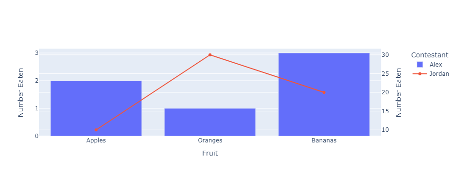
Figure Factory
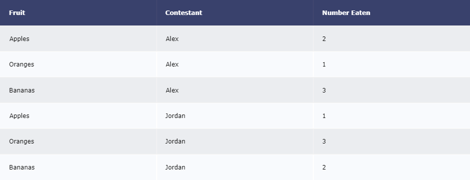
For a limited number of special graphs, use Figure Factory to create them. Since each graph has different function names and arguments, the only way to learn them is by looking at the Figure Factory explanation page on Plotly’s official website. Here is an example of using Figure Factory Tables to display data frame tables. First, import as follows according to the convention.
import plotly.figure_factory as ffThe data frame used in this article is used here. The usage is simple: simply specify the data frame in the create_table function.
fig = ff.create_table(df)Execute fig.show() to display the following table.
This is a basic use case.
The type of graph that was previously implemented only in Figure Factory but is now supported by Plotly Express is considered “legacy” and is deprecated for creation using Figure Factory. However, this does not mean that “legacy” should never be used. When creating KDE plots, which are used relatively often, or when setting color_scale to get a good color tone when creating a heatmap, use “legacy” Distplots and Annotated Heatmap, respectively.
Summary
This article has focused on the use of each of Plotly’s modules. Plotly is a commonly used library along with Matplotlib and Seaborn, but its many features can make it difficult to know which module to use. In such cases, I hope you will find this article useful.
The following article describes a visualization library called Altair, which is not as famous as Plotly, but which I personally like for its ease of detailed configuration and the appearance of its graphs.

Examples of dashboards created by combining Plotly and Dash can be found in this article.


コメント