In part 1, we set up the dashboard layout, and in part 2, we placed the Sidebar component and set the style, including margins and color scheme.
In this part, we will create graphs with Plotly and set up callbacks to make the graphs interactive.
The code presented in this article is available in the GitHub Repository here.
Dataset and Dashboard
In this case, we will use data from Kaggle’s tabular playground series Mar 2021. This data includes id, 19 categorical variables: cat0 – cat18, 11 continuous variables: cont0 – cont10, and a binary (0,1) target variable as shown in the table below.

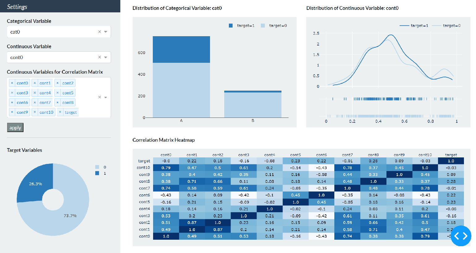
The goal is to create the following dashboard with the sidebar section on the left and the content section on the right.
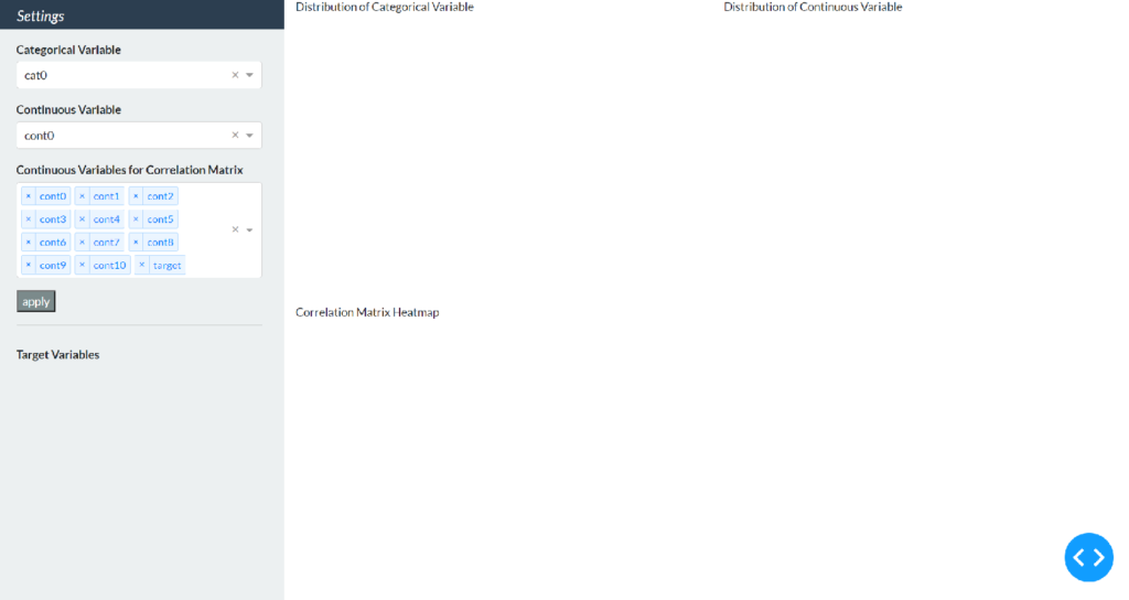
In the previous part, we have completed the sidebar setup as shown in the figure below, and now we will create graphs in Plotly.
Create Graphs with Plotly
This dashboard will display the following four graphs.
- Pie chart showing the distribution of target variable.
- Bar chart showing the distribution of the categorical variable selected in the first drop-down list
- Chart of probability distribution showing the distribution of the continuous variable selected in the second dropdown
- Correlation matrix heatmap of multiple continuous variables selected in the third drop-down list
Except for the pie chart, callbacks are set up so that the graph is updated according to the selection in the Sidebar drop-down list, but first, create the graph in Plotly without thinking about callbacks.
Plotly Modules
Plotly has three modules: Plotly Express, Graph Objects, and Figure Factory. Since Plotly Express is the easiest way to draw graphs with the least amount of code, Plotly’s official recommendation is to use it as the first option. In this case, Plotly Express is used for the pie chart and the bar chart, and Figure Factory is used for the probability distribution and the heatmap.
Note: When drawing distributions, it is recommended to use histogram in Plotly Express, but since it does not support probability density distribution (KDE plot) as in this case, ff.create_distplot is used. And also, when drawing annotated heatmaps, it is recommended to use imshow in Plotly Express but in this case, it is not easy to remove the legend and set the color scale based on blue, so ff.create_annotated_heatmap is used. For more information on the Plotly module, please see the following article.
Import the necessary modules.
import plotly.express as px
import plotly.figure_factory as ff
Sidebar Section
First, the pie chart is used as an example to illustrate the process from graph creation to display in Dash. The percentage of the target variables 0 and 1 in the total is calculated and assigned to the pie variable, and the graph is assigned to the fig_pie variable.
df = pd.read_csv('data/data_sample.csv')

pie = df.groupby('target').count()['id'] / len(df)

fig_pie = px.pie(pie.reset_index(),
                 values='id',
                 names='target',
                 hole=0.3,
                 color_discrete_sequence=['#bad6eb', '#2b7bba'])

fig_pie.update_layout(width=320,
                      height=250,
                      margin=dict(l=30, r=10, t=10, b=10),
                      paper_bgcolor='rgba(0,0,0,0)',
                      )
Create a pie chart using px.pie. The first argument is a data frame containing the percentage and label [0,1] of each target variable. The values and names arguments specify the column name that contains the target variable percentage and label name. The hole argument sets the size of the hole in the center of the pie chart, and the last argument specifies the color of the marker in dictionary form. This time, all graph colors are blue. #bad6eb means relatively light blue and #2b7bba means relatively dark blue.
Next, use update_layout to set the details of the graph. Set the arguments as follows.
- width: Graph Width
- height: Graph Vertical
- margin: Graph margins. l, r, t, b set left, right, top, and bottom margins, respectively.
- paper_bgcolor: Graph background color. In this case, the background color of the Plotly graph is set to transparent because the background color of the Sidebar is already set to bg-light.
Set the pie chart to appear at the bottom of the Sidebar. Rewrite the last dbc.Row we created in the previous part as follows.
dbc.Row(
            [
                html.Div([
                    html.P('Target Variables', className='font-weight-bold'),
                    dcc.Graph(figure=fig_pie)
                    ])
                ],
            style={"height": "45vh", 'margin': '8px'}
            )
Simply add dcc.Graph and specify fig_pie as the figure argument. html.P and dcc.Graph components are enclosed in html.Div to avoid unnatural margins.
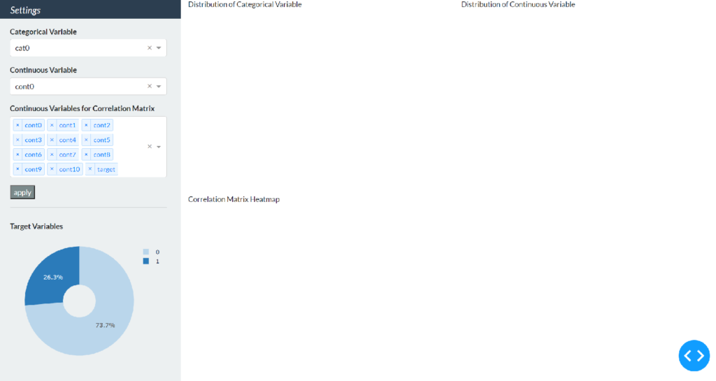
If we run the code here, we will see that the pie chart is displayed.
Content Section
Next, create a graph of the content section. Since this is before setting up the callbacks, we will create a bar chart for the categorical variable cat0, a probability distribution for the continuous variable cont0, and a correlation matrix heat map for all continuous and target variables. Create them with the variable names fig_bar, fig_dist, and fig_corr, respectively.
# bar chart
cat_pick = 'cat0'
bar_df = df.groupby(['target', cat_pick]).count()['id'].reset_index()
bar_df['target'] = bar_df['target'].replace({0: 'target=0', 1: 'target=1'})

fig_bar = px.bar(bar_df,
                 x=cat_pick,
                 y="id",
                 color="target",
                 color_discrete_sequence=['#bad6eb', '#2b7bba'])

fig_bar.update_layout(width=500,
                      height=340,
                      margin=dict(l=40, r=20, t=20, b=30),
                      paper_bgcolor='rgba(0,0,0,0)',
                      plot_bgcolor='rgba(0,0,0,0)',
                      legend_title=None,
                      yaxis_title=None,
                      xaxis_title=None,
                      legend=dict(
                          orientation="h",
                          yanchor="bottom",
                          y=1.02,
                          xanchor="right",
                          x=1
                          )
                      )

# Distribution Chart
cont_pick = 'cont0'
num0 = df[df['target'] == 0][cont_pick].values.tolist()
num1 = df[df['target'] == 1][cont_pick].values.tolist()

fig_dist = ff.create_distplot(hist_data=[num0, num1],
                              group_labels=['target=0', 'target=1'],
                              show_hist=False,
                              colors=['#bad6eb', '#2b7bba'])

fig_dist.update_layout(width=500,
                       height=340,
                       margin=dict(t=20, b=20, l=40, r=20),
                       paper_bgcolor='rgba(0,0,0,0)',
                       plot_bgcolor='rgba(0,0,0,0)',
                       legend=dict(
                           orientation="h",
                           yanchor="bottom",
                           y=1.02,
                           xanchor="right",
                           x=1
                           )
                       )

# Heatmap
corr_pick = vars_cont + ['target']
df_corr = df[corr_pick].corr()
x = list(df_corr.columns)
y = list(df_corr.index)
z = df_corr.values

fig_corr = ff.create_annotated_heatmap(
    z,
    x=x,
    y=y,
    annotation_text=np.around(z, decimals=2),
    hoverinfo='z',
    colorscale='Blues'
)
fig_corr.update_layout(width=1040,
                       height=300,
                       margin=dict(l=40, r=20, t=20, b=20),
                       paper_bgcolor='rgba(0,0,0,0)'
                       )
There are three areas that differ from the update_layout settings in the pie chart.
- barmode: Specify “stack” so that bars are stacked type.
- plot_bgcolor: Set the background color of the area bounded by the x- and y-axes of the bar chart and probability distribution to transparent.
- legend: Set bar graphs and probability distribution legends to appear horizontally in the upper right corner.
Modify the previously created content variable as follows.
content = html.Div(
    [
        dbc.Row(
            [
                dbc.Col(
                    [
                        html.Div([
                            html.P(id='bar-title',
                                   children='Distribution of Categorical Variable',
                                   className='font-weight-bold'),
                            dcc.Graph(id="bar-chart",
                                      figure=fig_bar,
                                      className='bg-light')])
                        ]),
                dbc.Col(
                    [
                        html.Div([
                            html.P(id='dist-title',
                                   children='Distribution of Continuous Variable',
                                   className='font-weight-bold'),
                            dcc.Graph(id="dist-chart",
                                      figure=fig_dist,
                                      className='bg-light')])
                        ])
                ],
            style={'height': '50vh',
                   'margin-top': '16px', 'margin-left': '8px',
                   'margin-bottom': '8px', 'margin-right': '8px'}),
        dbc.Row(
            [
                dbc.Col(
                    [
                        html.Div([
                            html.P('Correlation Matrix Heatmap',
                                   className='font-weight-bold'),
                            dcc.Graph(id='corr_chart',
                                      figure=fig_corr,
                                      className='bg-light')])
                        ])
                ],
            style={"height": "50vh", 'margin': '8px'})
        ]
    )
The basic usage of dcc.Graph is the same as for pie charts, but here the id argument is set. The id argument can be any arbitrary name and is used to identify the component in the callback setting. The background color is set to the same as the color of the Sidebar in the className to create a sense of overall unity.
The titles of the bar chart and probability distribution also specify an id in html.P to set up a callback so that the selected variable is displayed interactively. The contents of the string to be displayed using html.P are specified by the children argument.
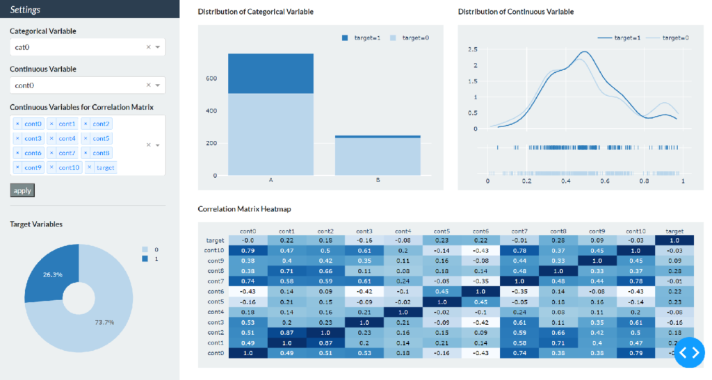
Running it again, we will see three graphs appear in Content.
Callback Settings
Now let’s set up the callback at the end. In this dashboard, we will set up the graph to be updated by selecting a variable in each drop-down list and pressing the “apply” button.
Import the necessary libraries for callbacks.
from dash.dependencies import Input, Output, StateThere are three Content graphs, but the callback setup procedure is the same, so the bar chart for categorical variables is used as an example to illustrate the setup procedure.
Input Class and Output Class
Callbacks can be implemented by adding the @app.callback decorator to a function that creates the graph. Then, specify inputs and outputs for that decorator and function. In this case, the input is a categorical variable chosen from the drop-down list, and the output is a bar chart and its title string, so the decorator and function would look like this.
@app.callback(Output('bar-chart', 'figure'),
              Output('bar-title', 'children'),
              Input('my-cat-picker', 'value'))
def update_bar(cat_pick):
    bar_df = df.groupby(['target', cat_pick]).count()['id'].reset_index()
    bar_df['target'] = bar_df['target'].replace({0: 'target=0', 1: 'target=1'})

    fig_bar = px.bar(bar_df,
                     x=cat_pick,
                     y="id",
                     color="target",
                     color_discrete_sequence=['#bad6eb', '#2b7bba'])

    fig_bar.update_layout(width=500,
                          height=340,
                          margin=dict(l=40, r=20, t=20, b=30),
                          paper_bgcolor='rgba(0,0,0,0)',
                          plot_bgcolor='rgba(0,0,0,0)',
                          legend_title=None,
                          yaxis_title=None,
                          xaxis_title=None,
                          legend=dict(
                              orientation="h",
                              yanchor="bottom",
                              y=1.02,
                              xanchor="right",
                              x=1
                              )
                          )

    title_bar = 'Distribution of Categorical Variable: ' + cat_pick

    return fig_bar, title_bar
The first argument of the Output and Input classes in the decorator is the id of the component and the second argument is the attributes of the component. Since the input is a categorical variable selected from the drop-down list, the first argument of the Input class is my-cat-picker and the second argument is value. The output is the bar chart and its title string, so the component id, bar-chart and bar-title, respectively, are specified as the first argument of the Output class. The second argument specifies figure and children, meaning graph and string. We have now set up a callback in which the variable selected in the drop-down list is passed to the cat_pick argument of the update_bar function above, and the corresponding graph and title are returned to the specified component.
The bar chart section of the content variable earlier was in the form of explicitly specifying the children and figure as shown below.
html.Div([
    html.P(id='bar-title',
           children='Distribution of Categorical Variable',
           className='font-weight-bold'),
    dcc.Graph(id="bar-chart",
              figure=fig_bar,
              className='bg-light')])
After setting the callback, remove the children and figure from the content variable as follows.
html.Div([
    html.P(id='bar-title',
           className='font-weight-bold'),
    dcc.Graph(id="bar-chart",
              className='bg-light')])
State Class
Now, selecting a categorical variable in the first drop-down list will immediately update the bar chart, but this time we will set the update to be triggered by a click on the “apply” button.
Simply modify the above decorators and functions as follows.
@app.callback(Output('bar-chart', 'figure'),
              Output('bar-title', 'children'),
              Input('my-button', 'n_clicks'),
              State('my-cat-picker', 'value'))
def update_bar(n_clicks, cat_pick):
    # Same hereafter
By specifying the apply button in the Input class and making n_clicks the first argument of the update_bar function, the click of the apply button triggers the update of the graph by referencing the item selected in the drop-down list specified in the State class.
Set up callbacks for the other two graphs in the same way.
@app.callback(Output('dist-chart', 'figure'),
              Output('dist-title', 'children'),
              Input('my-button', 'n_clicks'),
              State('my-cont-picker', 'value'))
def update_dist(n_clicks, cont_pick):
    num0 = df[df['target'] == 0][cont_pick].values.tolist()
    num1 = df[df['target'] == 1][cont_pick].values.tolist()

    fig_dist = ff.create_distplot(hist_data=[num0, num1],
                                  group_labels=['target=0', 'target=1'],
                                  show_hist=False,
                                  colors=['#bad6eb', '#2b7bba'])

    fig_dist.update_layout(width=500,
                           height=340,
                           margin=dict(t=20, b=20, l=40, r=20),
                           paper_bgcolor='rgba(0,0,0,0)',
                           plot_bgcolor='rgba(0,0,0,0)',
                           legend=dict(
                               orientation="h",
                               yanchor="bottom",
                               y=1.02,
                               xanchor="right",
                               x=1
                               )
                           )

    title_dist = 'Distribution of Continuous Variable: ' + cont_pick

    return fig_dist, title_dist


@app.callback(Output('corr-chart', 'figure'),
              Input('my-button', 'n_clicks'),
              State('my-corr-picker', 'value'))
def update_corr(n_clicks, corr_pick):
    df_corr = df[corr_pick].corr()
    x = list(df_corr.columns)
    y = list(df_corr.index)
    z = df_corr.values

    fig_corr = ff.create_annotated_heatmap(
        z,
        x=x,
        y=y,
        annotation_text=np.around(z, decimals=2),
        hoverinfo='z',
        colorscale='Blues'
    )

    fig_corr.update_layout(width=1040,
                           height=300,
                           margin=dict(l=40, r=20, t=20, b=20),
                           paper_bgcolor='rgba(0,0,0,0)'
                           )

    return fig_corr
The entire code, with the content variable modified, looks like this.
import dash
import dash_bootstrap_components as dbc
import dash_core_components as dcc
import dash_html_components as html
from dash.dependencies import Input, Output, State
import pandas as pd
import numpy as np

import plotly.express as px
import plotly.figure_factory as ff


df = pd.read_csv('data/data_sample.csv')
vars_cat = [var for var in df.columns if var.startswith('cat')]
vars_cont = [var for var in df.columns if var.startswith('cont')]

app = dash.Dash(external_stylesheets=[dbc.themes.FLATLY])

# pie chart
pie = df.groupby('target').count()['id'] / len(df)

fig_pie = px.pie(pie.reset_index(),
                 values='id',
                 names='target',
                 hole=0.3,
                 color_discrete_sequence=['#bad6eb', '#2b7bba'])

fig_pie.update_layout(
    width=320,
    height=250,
    margin=dict(l=30, r=10, t=10, b=10),
    paper_bgcolor='rgba(0,0,0,0)',
)

sidebar = html.Div(
    [
        dbc.Row(
            [
                html.H5('Settings',
                        style={'margin-top': '12px', 'margin-left': '24px'})
                ],
            style={"height": "5vh"},
            className='bg-primary text-white font-italic'
            ),
        dbc.Row(
            [
                html.Div([
                    html.P('Categorical Variable',
                           style={'margin-top': '8px', 'margin-bottom': '4px'},
                           className='font-weight-bold'),
                    dcc.Dropdown(id='my-cat-picker', multi=False, value='cat0',
                                 options=[{'label': x, 'value': x}
                                          for x in vars_cat],
                                 style={'width': '320px'}
                                 ),
                    html.P('Continuous Variable',
                           style={'margin-top': '16px', 'margin-bottom': '4px'},
                           className='font-weight-bold'),
                    dcc.Dropdown(id='my-cont-picker', multi=False, value='cont0',
                                 options=[{'label': x, 'value': x}
                                          for x in vars_cont],
                                 style={'width': '320px'}
                                 ),
                    html.P('Continuous Variables for Correlation Matrix',
                           style={'margin-top': '16px', 'margin-bottom': '4px'},
                           className='font-weight-bold'),
                    dcc.Dropdown(id='my-corr-picker', multi=True,
                                 value=vars_cont + ['target'],
                                 options=[{'label': x, 'value': x}
                                          for x in vars_cont + ['target']],
                                 style={'width': '320px'}
                                 ),
                    html.Button(id='my-button', n_clicks=0, children='apply',
                                style={'margin-top': '16px'},
                                className='bg-dark text-white'),
                    html.Hr()
                ]
                )
            ],
            style={'height': '50vh', 'margin': '8px'}),
        dbc.Row(
            [
                html.Div([
                    html.P('Target Variables', className='font-weight-bold'),
                    dcc.Graph(figure=fig_pie)
                    ])
                ],
            style={"height": "45vh", 'margin': '8px'}
            )
        ]
    )

content = html.Div(
    [
        dbc.Row(
            [
                dbc.Col(
                    [
                        html.Div([
                            html.P(id='bar-title',
                                   className='font-weight-bold'),
                            dcc.Graph(id="bar-chart",
                                      className='bg-light')])
                        ]),
                dbc.Col(
                    [
                        html.Div([
                            html.P(id='dist-title',
                                   className='font-weight-bold'),
                            dcc.Graph(id="dist-chart",
                                      className='bg-light')])
                        ])
                ],
            style={'height': '50vh',
                   'margin-top': '16px', 'margin-left': '8px',
                   'margin-bottom': '8px', 'margin-right': '8px'}),
        dbc.Row(
            [
                dbc.Col(
                    [
                        html.Div([
                            html.P('Correlation Matrix Heatmap',
                                   className='font-weight-bold'),
                            dcc.Graph(id='corr-chart',
                                      className='bg-light')])
                        ])
                ],
            style={"height": "50vh", 'margin': '8px'})
        ]
    )

app.layout = dbc.Container(
    [
        dbc.Row(
            [
                dbc.Col(sidebar, width=3, className='bg-light'),
                dbc.Col(content, width=9)
                ]
            ),
        ],
    fluid=True
    )


@app.callback(Output('bar-chart', 'figure'),
              Output('bar-title', 'children'),
              Input('my-button', 'n_clicks'),
              State('my-cat-picker', 'value'))
def update_bar(n_clicks, cat_pick):
    bar_df = df.groupby(['target', cat_pick]).count()['id'].reset_index()
    bar_df['target'] = bar_df['target'].replace({0: 'target=0', 1: 'target=1'})

    fig_bar = px.bar(bar_df,
                     x=cat_pick,
                     y="id",
                     color="target",
                     color_discrete_sequence=['#bad6eb', '#2b7bba'])

    fig_bar.update_layout(width=500,
                          height=340,
                          margin=dict(l=40, r=20, t=20, b=30),
                          paper_bgcolor='rgba(0,0,0,0)',
                          plot_bgcolor='rgba(0,0,0,0)',
                          legend_title=None,
                          yaxis_title=None,
                          xaxis_title=None,
                          legend=dict(
                              orientation="h",
                              yanchor="bottom",
                              y=1.02,
                              xanchor="right",
                              x=1
                              )
                          )

    title_bar = 'Distribution of Categorical Variable: ' + cat_pick

    return fig_bar, title_bar


@app.callback(Output('dist-chart', 'figure'),
              Output('dist-title', 'children'),
              Input('my-button', 'n_clicks'),
              State('my-cont-picker', 'value'))
def update_dist(n_clicks, cont_pick):
    num0 = df[df['target'] == 0][cont_pick].values.tolist()
    num1 = df[df['target'] == 1][cont_pick].values.tolist()

    fig_dist = ff.create_distplot(hist_data=[num0, num1],
                                  group_labels=['target=0', 'target=1'],
                                  show_hist=False,
                                  colors=['#bad6eb', '#2b7bba'])

    fig_dist.update_layout(width=500,
                           height=340,
                           margin=dict(t=20, b=20, l=40, r=20),
                           paper_bgcolor='rgba(0,0,0,0)',
                           plot_bgcolor='rgba(0,0,0,0)',
                           legend=dict(
                               orientation="h",
                               yanchor="bottom",
                               y=1.02,
                               xanchor="right",
                               x=1
                               )
                           )

    title_dist = 'Distribution of Continuous Variable: ' + cont_pick

    return fig_dist, title_dist


@app.callback(Output('corr-chart', 'figure'),
              Input('my-button', 'n_clicks'),
              State('my-corr-picker', 'value'))
def update_corr(n_clicks, corr_pick):
    df_corr = df[corr_pick].corr()
    x = list(df_corr.columns)
    y = list(df_corr.index)
    z = df_corr.values

    fig_corr = ff.create_annotated_heatmap(
        z,
        x=x,
        y=y,
        annotation_text=np.around(z, decimals=2),
        hoverinfo='z',
        colorscale='Blues'
    )

    fig_corr.update_layout(width=1040,
                           height=300,
                           margin=dict(l=40, r=20, t=20, b=20),
                           paper_bgcolor='rgba(0,0,0,0)'
                           )

    return fig_corr


if __name__ == "__main__":
    app.run_server(debug=True, port=1234)
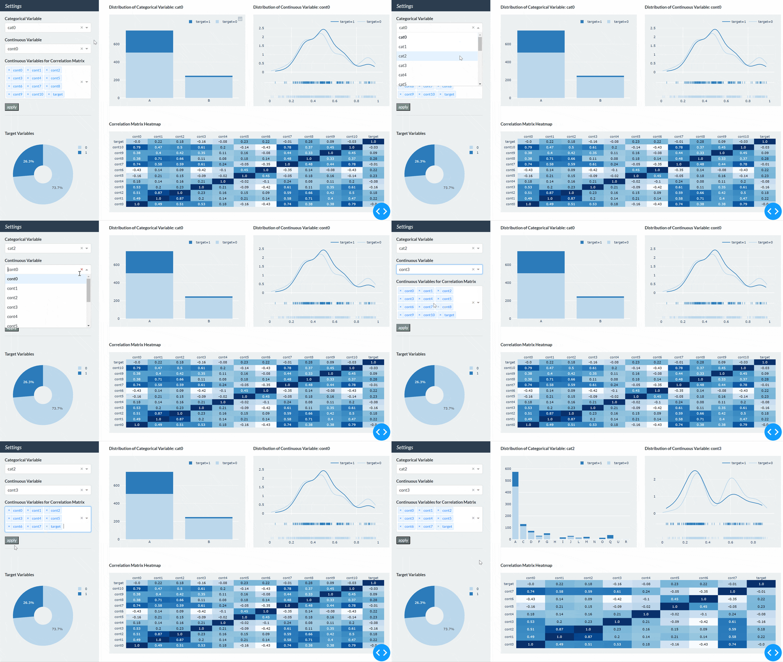
Finally, run it again to check the operation. You can confirm that the dashboard is updated when you select any variable in Sidebar and press the apply button, as shown in the figure below.
Conclusion
It has been a long road, but we have found that Dash and Plotly allow us to create dashboards with finely customized color schemes, margins, and component settings.
Streamlit is also recommended for those who find it difficult to customize. It is not as finely customized as Dash, but if you can accept the default settings, you can create a similar dashboard with less than half the coding. How to create a dashboard using Streamlit and Plotly is described in another article.




コメント