
前々回のレイアウト編でダッシュボード全体のレイアウトを設定し、前回のコンポーネント、スタイル編ではSidebarのコンポーネントを配置した上で余白や配色などの見た目を整えました。

今回はPlotlyでグラフを作成し、さらにインタラクティブにグラフを更新できるようにコールバックを設定します。
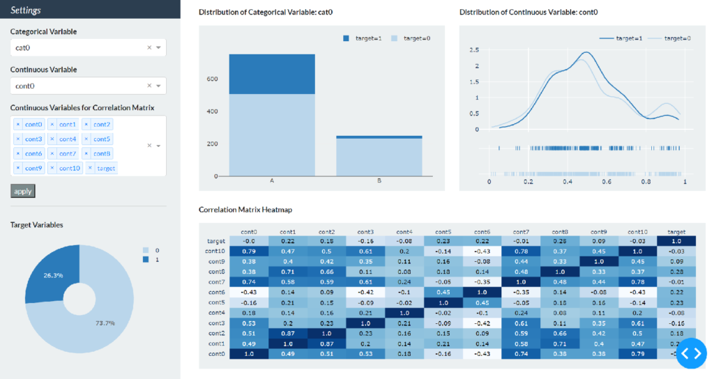
作成するダッシュボード
完成図
前回のコンポーネント・スタイル編でもお見せしましたが、以下のようにSidebarで特徴や相関関係などを確認したいカテゴリカル変数・連続変数をそれぞれ選択し、右側Content部分に選択した変数の分布や相関行列のヒートマップが出力されるダッシュボードの作成を目指します。
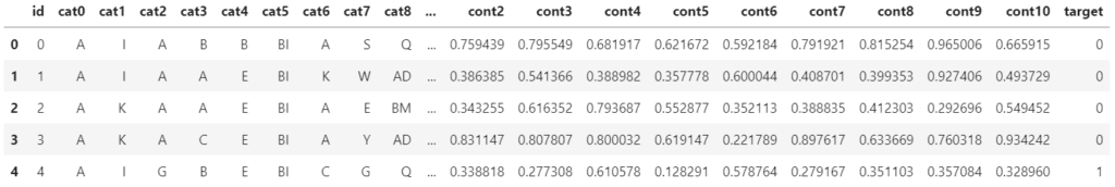
こちらも前回紹介しましたが、上記のダッシュボードは kaggleのtabular playground series Mar 2021 のデータの一部を使用しています。 このデータは下表の通りサンプルidと19個のカテゴリカル変数(cat0 ~ cat18)と11個の連続変数(cont0 ~ cont10)、そして2値(0,1)のターゲット変数が含まれます。
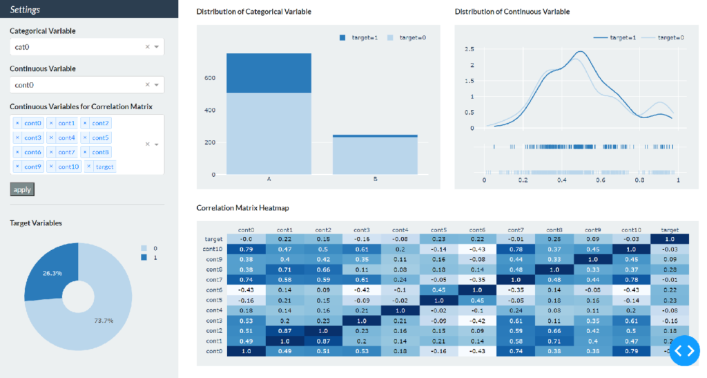
前回までのダッシュボード
前回のコンポーネント・スタイル編では下図のようにダッシュボードのSidebarのスタイルを整えるところまで完了しましたので、次にPlotlyでグラフを作成していきます。
Plotlyを使ったグラフの作成
今回のダッシュボードでは以下の4つのグラフを表示させます。
- ターゲット変数の分布を示す円グラフ
- 1つ目のドロップダウンで選択したカテゴリカル変数の分布を示す棒グラフ
- 2つ目のドロップダウンで選択した連続変数の分布を示す確率分布のグラフ
- 3つ目のドロップダウンで選択した複数の連続変数・ターゲット変数の相関行列ヒートマップ
円グラフ以外はSidebarのドロップダウンの選択によってグラフが更新されるようにコールバックを設定しますが、まずはコールバックのことは考えずにPlotlyでグラフを作成します。
Plotlyの必要なモジュールをインポートします。円グラフと棒グラフはgraph_objects、確率分布とヒートマップはfigure_factoryを使います。
※Plotlyの必要なモジュールについては最後の【補足】もあわせてご覧ください。
import plotly.graph_objects as go
import plotly.figure_factory as ff
Sidebarのグラフ
最初にSidebarの円グラフを例にグラフ作成からdashで表示するまでのプロセスを示します。読み込んだkaggleデータのターゲット変数0,1の全体に占める割合を計算してpie変数に格納し、fig_pie変数にグラフを作成していきます。
df = pd.read_csv('data/data_sample.csv')

pie = df.groupby('target').count()['id'] / len(df)

fig_pie = go.Figure(
    data=[go.Pie(labels=list(pie.index),
                 values=pie.values,
                 hole=.3,
                 marker=dict(colors=['#bad6eb', '#2b7bba']))])

fig_pie.update_layout(
    width=320,
    height=250,
    margin=dict(l=30, r=10, t=10, b=10),
    paper_bgcolor='rgba(0,0,0,0)',
)
go.Figure内のgo.Pieでグラフの種類を円グラフに指定し、labelsとvaluesにそれぞれラベル[0,1]と計算した割合を入れます。holeで中心の穴の大きさを設定し、markerの色を辞書形式で指定します。今回はすべてのグラフの色を青系で統一します。#bad6ebは比較的薄い青色を#2b7bbaは比較的濃い青色を意味しています。
次にupdate_layoutでグラフの細かい設定をします。具体的な項目は以下の通りです。
- width: グラフの横幅
- height: グラフの縦幅
- margin: グラフの上下左右の余白。l, r, t, bはそれぞれ左、右、上、下の余白を設定
- paper_bgcolor: グラフの背景色。今回は既にSidebarの背景色がbg-lightに設定されているので、plotlyグラフの背景色は透明に設定
fig_pieに円グラフを作成したので、Sidebarの下部分に表示させます。現状ではTarget Variablesと文字列を表示させているだけなので、前回作成した一番最後のdbc.Row次のように書き換えます。
dbc.Row(
            [
                html.Div([
                    html.P('Target Variables', className='font-weight-bold'),
                    dcc.Graph(figure=fig_pie)
                    ])
                ],
            style={"height": "45vh", 'margin': '8px'}
            )
html.Pの下にdcc.Graphを書いてfigure引数にfig_pieを指定するだけです。不自然な余白が生まれないように文字列とグラフのコンポーネントをhtml.Divで囲っています。
ここで一度実行すると、円グラフが表示されることが確認できます。
Contentのグラフ
次にContentに表示する3つのグラフを作成します。まだコールバックを考えていないので、カテゴリカル変数はcat0を選択した場合の棒グラフを作成、連続変数はcont0を選択した場合の確率分布を作成、そして全ての連続変数とターゲット変数を選択した場合のヒートマップを作成します。それぞれfig_bar, fig_dist, fig_corrという変数名としています。
# bar chart
cat_pick = 'cat0'
cat0 = df[df['target'] == 0].groupby(cat_pick).count()['id']
cat1 = df[df['target'] == 1].groupby(cat_pick).count()['id']

fig_bar = go.Figure(data=[
    go.Bar(name='target=0',
           x=list(cat0.index),
           y=cat0.values,
           marker=dict(color='#bad6eb')),
    go.Bar(name='target=1',
           x=list(cat1.index),
           y=cat1.values,
           marker=dict(color='#2b7bba'))])

fig_bar.update_layout(
    barmode='stack',
    width=500,
    height=340,
    margin=dict(l=40, r=20, t=20, b=30),
    paper_bgcolor='rgba(0,0,0,0)',
    plot_bgcolor='rgba(0,0,0,0)',
    legend=dict(
        orientation="h",
        yanchor="bottom",
        y=1.02,
        xanchor="right",
        x=1
    )
)

# Distribution Chart
cont_pick = 'cont0'
num0 = df[df['target'] == 0][cont_pick].values.tolist()
num1 = df[df['target'] == 1][cont_pick].values.tolist()

fig_dist = ff.create_distplot(hist_data=[num0, num1],
                              group_labels=['target=0', 'target=1'],
                              show_hist=False,
                              colors=['#bad6eb', '#2b7bba'])

fig_dist.update_layout(width=500,
                       height=340,
                       margin=dict(t=20, b=20, l=40, r=20),
                       paper_bgcolor='rgba(0,0,0,0)',
                       plot_bgcolor='rgba(0,0,0,0)',
                       legend=dict(
                           orientation="h",
                           yanchor="bottom",
                           y=1.02,
                           xanchor="right",
                           x=1
                           )
                       )

# Heatmap
corr_pick = vars_cont + ['target']
df_corr = df[corr_pick].corr()
x = list(df_corr.columns)
y = list(df_corr.index)
z = df_corr.values

fig_corr = ff.create_annotated_heatmap(
    z,
    x=x,
    y=y,
    annotation_text=np.around(z, decimals=2),
    hoverinfo='z',
    colorscale='Blues'
)
fig_corr.update_layout(width=1040,
                       height=300,
                       margin=dict(l=40, r=20, t=20, b=20),
                       paper_bgcolor='rgba(0,0,0,0)'
                       )
円グラフのレイアウトの設定と異なる部分は以下の3つです。
- barmode: 棒グラフが積み上げタイプになるようにstackと指定
- plot_bgcolor: 棒グラフと確率分布はx軸とy軸に囲まれた範囲に別の色が付くため透明に設定
- legend: 棒グラフと確率分布の凡例は右上に水平方向に表示されるように設定
前回作成したコードを以下のように修正して、content変数に作成したグラフを配置します。
content = html.Div(
    [
        dbc.Row(
            [
                dbc.Col(
                    [
                        html.Div([
                            html.P(id='bar-title',
                                   children='Distribution of Categorical Variable',
                                   className='font-weight-bold'),
                            dcc.Graph(id="bar-chart",
                                      figure=fig_bar,
                                      className='bg-light')])
                        ]),
                dbc.Col(
                    [
                        html.Div([
                            html.P(id='dist-title',
                                   children='Distribution of Continuous Variable',
                                   className='font-weight-bold'),
                            dcc.Graph(id="dist-chart",
                                      figure=fig_dist,
                                      className='bg-light')])
                        ])
                ],
            style={'height': '50vh',
                   'margin-top': '16px', 'margin-left': '8px',
                   'margin-bottom': '8px', 'margin-right': '8px'}),
        dbc.Row(
            [
                dbc.Col(
                    [
                        html.Div([
                            html.P('Correlation Matrix Heatmap',
                                   className='font-weight-bold'),
                            dcc.Graph(id='corr_chart',
                                      figure=fig_corr,
                                      className='bg-light')])
                        ])
                ],
            style={"height": "50vh", 'margin': '8px'})
        ]
    )
dcc.Graphの基本的な使い方は円グラフと同じです。ただしContentのグラフにはidを指定しており、これらはコールバックにおいてコンポーネントの特定に使います(任意のidを指定可能)。またclassNameで全体の統一感が出るようにSidebarと同じ背景色を設定しています。
html.Pで表示する棒グラフと確率分布のタイトルも、選択した変数がインタラクティブに表示されるようにコールバックを設定するためidを指定します。ここまで明示的に書いてなかったのですが、html.Pで表示する文字列の内容はchildren引数で指定します(コールバック設定時に説明しやすいため)。
再度実行すると、Contentに3つのグラフが表示されるのが確認できます。
コールバックの設定
それでは最後に、Contentのグラフがインタラクティブに更新されるようにコールバックを設定します。今回のダッシュボードでは各ドロップダウンで変数を選択した後に、その下のapplyボタンを押すとグラフが更新されるように設定します。
コールバックに必要なライブラリをインポートします。
from dash.dependencies import Input, Output, StateContentのグラフは3つありますが、コールバックの設定方法は同じなのでカテゴリカル変数の棒グラフを例に設定手順を示します。
Inputクラス、Outputクラスを使った基本形
コールバックの機能はインプットを引数に取ってアウトプットを返す関数に @app.callback デコレータを付けることで実装できます。今回の場合はインプットがドロップダウンで選んだカテゴリカル変数で、アウトプットが対応する棒グラフとタイトルの文字列になるので、関数とデコレータは以下のようになります
@app.callback(Output('bar-chart', 'figure'),
              Output('bar-title', 'children'),
              Input('my-cat-picker', 'value'))
def update_bar(cat_pick):
    cat0 = df[df['target'] == 0].groupby(cat_pick).count()['id']
    cat1 = df[df['target'] == 1].groupby(cat_pick).count()['id']

    fig_bar = go.Figure(data=[
        go.Bar(name='target=0',
               x=list(cat0.index),
               y=cat0.values,
               marker=dict(color='#bad6eb')),
        go.Bar(name='target=1',
               x=list(cat1.index),
               y=cat1.values,
               marker=dict(color='#2b7bba'))])

    fig_bar.update_layout(
        barmode='stack',
        width=500,
        height=340,
        margin=dict(l=40, r=20, t=20, b=30),
        paper_bgcolor='rgba(0,0,0,0)',
        plot_bgcolor='rgba(0,0,0,0)',
        legend=dict(
            orientation="h",
            yanchor="bottom",
            y=1.02,
            xanchor="right",
            x=1
        )
    )

    title_bar = 'Distribution of Categorical Variable: ' + cat_pick

    return fig_bar, title_bar
デコレータの中のOutputクラスとInputクラスの第1引数はコンポーネントのIDで第2引数はコンポーネントの属性を渡します。インプットはカテゴリカル変数を選択するドロップダウンで選択した項目なので、Inputクラスの第1引数がmy-cat-pickerで第2引数にはvalueを指定します。アウトプットは2つあり、それぞれ出力させたいコンポーネントidのbar-chartとbar-titleをOutputクラスの第1引数に指定します。第2引数はグラフと文字列に対応するfigureとchildrenを指定します。以上でドロップダウンで選択した変数が上記update_bar関数の引数cat_pickに渡されて、対応するグラフとタイトルが指定したコンポーネントに返されるコールバックが設定できました。
先ほどcontent変数の棒グラフの箇所は以下のようにchildrenとfigureを明示的に指定する形になっていました(再掲)。
html.Div([
    html.P(id='bar-title',
           children='Distribution of Categorical Variable',
           className='font-weight-bold'),
    dcc.Graph(id="bar-chart",
              figure=fig_bar,
              className='bg-light')])
コールバック設定後は以下のようにchildrenとfigureをcontent変数から削除します。
html.Div([
    html.P(id='bar-title',
           className='font-weight-bold'),
    dcc.Graph(id="bar-chart",
              className='bg-light')])
Stateクラス
これでカテゴリカル変数を1つ目のドロップダウンで選択すると直ちに棒グラフが更新されるようになりましたが、今回はapplyボタンのクリックをトリガーにして更新されるように設定します。
上記のデコレータと関数を次のように修正するだけです。
@app.callback(Output('bar-chart', 'figure'),
              Output('bar-title', 'children'),
              Input('my-button', 'n_clicks'),
              State('my-cat-picker', 'value'))
def update_bar(n_clicks, cat_pick):
    # 以下同じ
InputクラスにSidebarに配置したボタンを指定し、n_clicksをupdate_barの第1引数にすることでボタンのクリックをトリガーに、Stateクラスに指定したドロップダウンで選択した項目が参照されることでグラフが更新されるようになります。
他の2つのグラフのコールバックを同じように設定します。
@app.callback(Output('dist-chart', 'figure'),
              Output('dist-title', 'children'),
              Input('my-button', 'n_clicks'),
              State('my-cont-picker', 'value'))
def update_dist(n_clicks, cont_pick):
    num0 = df[df['target'] == 0][cont_pick].values.tolist()
    num1 = df[df['target'] == 1][cont_pick].values.tolist()

    fig_dist = ff.create_distplot(hist_data=[num0, num1],
                                  group_labels=['target=0', 'target=1'],
                                  show_hist=False,
                                  colors=['#bad6eb', '#2b7bba'])

    fig_dist.update_layout(width=500,
                           height=340,
                           margin=dict(t=20, b=20, l=40, r=20),
                           paper_bgcolor='rgba(0,0,0,0)',
                           plot_bgcolor='rgba(0,0,0,0)',
                           legend=dict(
                               orientation="h",
                               yanchor="bottom",
                               y=1.02,
                               xanchor="right",
                               x=1
                           ))

    title_dist = 'Distribution of Continuous Variable: ' + cont_pick

    return fig_dist, title_dist


@app.callback(Output('corr-chart', 'figure'),
              Input('my-button', 'n_clicks'),
              State('my-corr-picker', 'value'))
def update_corr(n_clicks, corr_pick):
    df_corr = df[corr_pick].corr()
    x = list(df_corr.columns)
    y = list(df_corr.index)
    z = df_corr.values

    fig_corr = ff.create_annotated_heatmap(
        z,
        x=x,
        y=y,
        annotation_text=np.around(z, decimals=2),
        hoverinfo='z',
        colorscale='Blues'
    )

    fig_corr.update_layout(width=1040,
                           height=300,
                           margin=dict(l=40, r=20, t=20, b=20),
                           paper_bgcolor='rgba(0,0,0,0)'
                           )

    return fig_corr
content変数を修正したコード全体は以下のようになります。
import dash
import dash_bootstrap_components as dbc
import dash_core_components as dcc
import dash_html_components as html
from dash.dependencies import Input, Output, State
import pandas as pd
import numpy as np
import plotly.graph_objects as go
import plotly.figure_factory as ff
df = pd.read_csv('data/data_sample.csv')
vars_cat = [var for var in df.columns if var.startswith('cat')]
vars_cont = [var for var in df.columns if var.startswith('cont')]
app = dash.Dash(external_stylesheets=[dbc.themes.FLATLY])
# pie chart
pie = df.groupby('target').count()['id'] / len(df)
fig_pie = go.Figure(
data=[go.Pie(labels=list(pie.index),
values=pie.values,
hole=.3,
marker=dict(colors=['#bad6eb', '#2b7bba']))])
fig_pie.update_layout(
width=320,
height=250,
margin=dict(l=30, r=10, t=10, b=10),
paper_bgcolor='rgba(0,0,0,0)',
)
sidebar = html.Div(
[
dbc.Row(
[
html.H5('Settings',
style={'margin-top': '12px', 'margin-left': '24px'})
],
style={"height": "5vh"},
className='bg-primary text-white font-italic'
),
dbc.Row(
[
html.Div([
html.P('Categorical Variable',
style={'margin-top': '8px', 'margin-bottom': '4px'},
className='font-weight-bold'),
dcc.Dropdown(id='my-cat-picker', multi=False, value='cat0',
options=[{'label': x, 'value': x}
for x in vars_cat],
style={'width': '320px'}
),
html.P('Continuous Variable',
style={'margin-top': '16px', 'margin-bottom': '4px'},
className='font-weight-bold'),
dcc.Dropdown(id='my-cont-picker', multi=False, value='cont0',
options=[{'label': x, 'value': x}
for x in vars_cont],
style={'width': '320px'}
),
html.P('Continuous Variables for Correlation Matrix',
style={'margin-top': '16px', 'margin-bottom': '4px'},
className='font-weight-bold'),
dcc.Dropdown(id='my-corr-picker', multi=True,
value=vars_cont + ['target'],
options=[{'label': x, 'value': x}
for x in vars_cont + ['target']],
style={'width': '320px'}
),
html.Button(id='my-button', n_clicks=0, children='apply',
style={'margin-top': '16px'},
className='bg-dark text-white'),
html.Hr()
]
)
],
style={'height': '50vh', 'margin': '8px'}),
dbc.Row(
[
html.Div([
html.P('Target Variables', className='font-weight-bold'),
dcc.Graph(figure=fig_pie)
])
],
style={"height": "45vh", 'margin': '8px'}
)
]
)
content = html.Div(
[
dbc.Row(
[
dbc.Col(
[
html.Div([
html.P(id='bar-title',
className='font-weight-bold'),
dcc.Graph(id="bar-chart",
className='bg-light')])
]),
dbc.Col(
[
html.Div([
html.P(id='dist-title',
className='font-weight-bold'),
dcc.Graph(id="dist-chart",
className='bg-light')])
])
],
style={'height': '50vh',
'margin-top': '16px', 'margin-left': '8px',
'margin-bottom': '8px', 'margin-right': '8px'}),
dbc.Row(
[
dbc.Col(
[
html.Div([
html.P('Correlation Matrix Heatmap',
className='font-weight-bold'),
dcc.Graph(id='corr-chart',
className='bg-light')])
])
],
style={"height": "50vh", 'margin': '8px'})
]
)
app.layout = dbc.Container(
[
dbc.Row(
[
dbc.Col(sidebar, width=3, className='bg-light'),
dbc.Col(content, width=9)
]
),
],
fluid=True
)
@app.callback(Output('bar-chart', 'figure'),
Output('bar-title', 'children'),
Input('my-button', 'n_clicks'),
State('my-cat-picker', 'value'))
def update_bar(n_clicks, cat_pick):
cat0 = df[df['target'] == 0].groupby(cat_pick).count()['id']
cat1 = df[df['target'] == 1].groupby(cat_pick).count()['id']
fig_bar = go.Figure(data=[
go.Bar(name='target=0',
x=list(cat0.index),
y=cat0.values,
marker=dict(color='#bad6eb')),
go.Bar(name='target=1',
x=list(cat1.index),
y=cat1.values,
marker=dict(color='#2b7bba'))])
fig_bar.update_layout(
barmode='stack',
width=500,
height=340,
margin=dict(l=40, r=20, t=20, b=30),
paper_bgcolor='rgba(0,0,0,0)',
plot_bgcolor='rgba(0,0,0,0)',
legend=dict(
orientation="h",
yanchor="bottom",
y=1.02,
xanchor="right",
x=1
)
)
title_bar = 'Distribution of Categorical Variable: ' + cat_pick
return fig_bar, title_bar
@app.callback(Output('dist-chart', 'figure'),
Output('dist-title', 'children'),
Input('my-button', 'n_clicks'),
State('my-cont-picker', 'value'))
def update_dist(n_clicks, cont_pick):
num0 = df[df['target'] == 0][cont_pick].values.tolist()
num1 = df[df['target'] == 1][cont_pick].values.tolist()
fig_dist = ff.create_distplot(hist_data=[num0, num1],
group_labels=['target=0', 'target=1'],
show_hist=False,
colors=['#bad6eb', '#2b7bba'])
fig_dist.update_layout(width=500,
height=340,
margin=dict(t=20, b=20, l=40, r=20),
paper_bgcolor='rgba(0,0,0,0)',
plot_bgcolor='rgba(0,0,0,0)',
legend=dict(
orientation="h",
yanchor="bottom",
y=1.02,
xanchor="right",
x=1
))
title_dist = 'Distribution of Continuous Variable: ' + cont_pick
return fig_dist, title_dist
@app.callback(Output('corr-chart', 'figure'),
Input('my-button', 'n_clicks'),
State('my-corr-picker', 'value'))
def update_corr(n_clicks, corr_pick):
df_corr = df[corr_pick].corr()
x = list(df_corr.columns)
y = list(df_corr.index)
z = df_corr.values
fig_corr = ff.create_annotated_heatmap(
z,
x=x,
y=y,
annotation_text=np.around(z, decimals=2),
hoverinfo='z',
colorscale='Blues'
)
fig_corr.update_layout(width=1040,
height=300,
margin=dict(l=40, r=20, t=20, b=20),
paper_bgcolor='rgba(0,0,0,0)'
)
return fig_corr
if __name__ == "__main__":
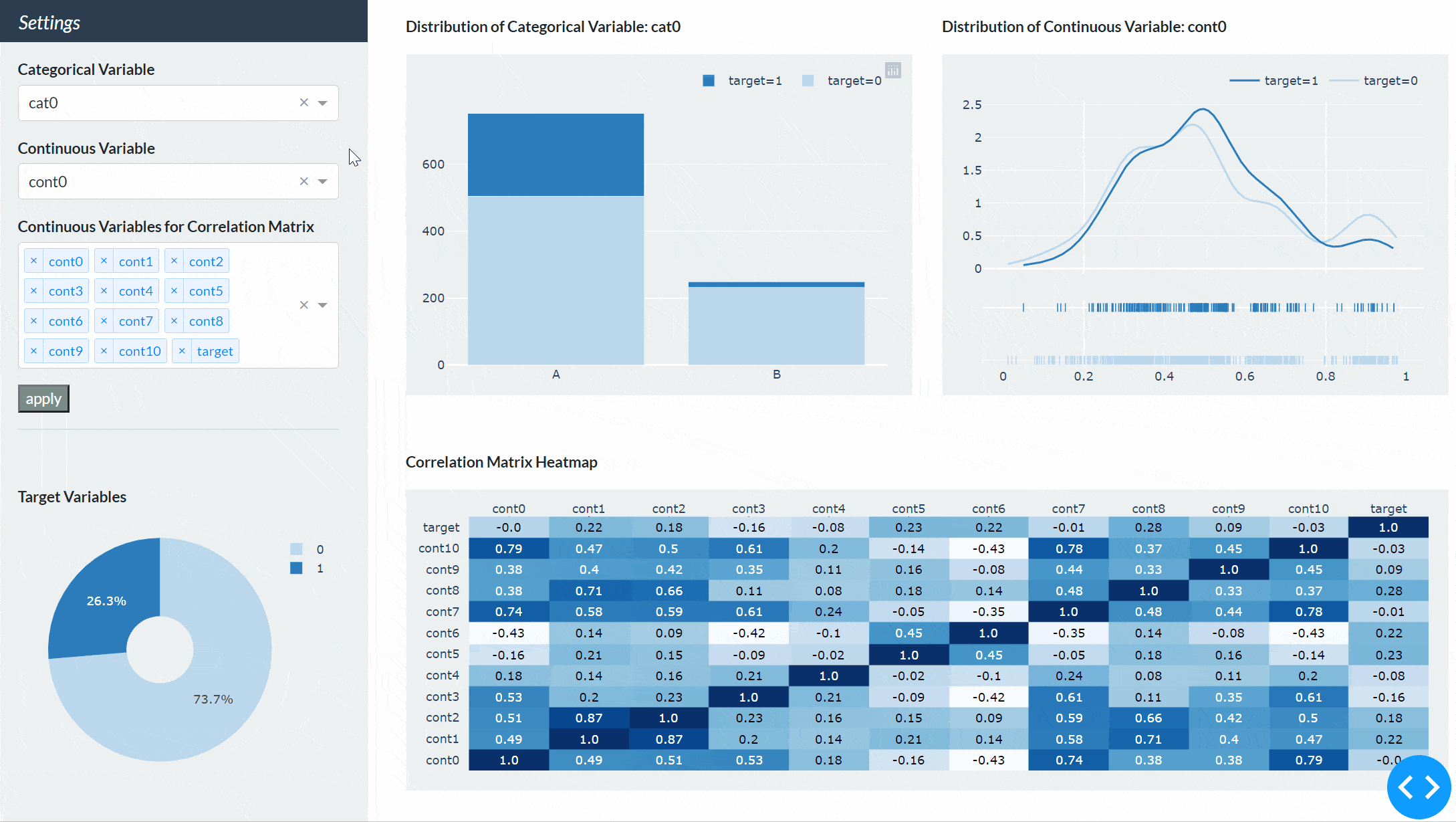
app.run_server(debug=True, port=1234)最後にもう一度実行した後に、Sidebarで任意の変数を選択してapplyボタンを押すと下図のようにダッシュボードが更新されることが確認できます。
長い道のりでしたが、DashとPlotlyで細かくカスタマイズすることで配色や余白、配置など自分好みのダッシュボードを作成できることが分かりました。
カスタマイズ部分が結構大変だという方はStreamlitもオススメです。Dashのように配色や余白などの細かいカスタマイズはできないのですが、デフォルトの設定を受け入れることができれば半分以下のコーディングで同じようなダッシュボードが作成できます。StreamlitとPlotlyを使ったダッシュボードの作成方法は別の記事で書いています。

【補足】Plotlyのモジュールについて
※こちらの補足は2022/2/13に追記しました。
Plotlyにはexpress, graph_objects, figure_factoryの3つのモジュールがあります。expressが最も簡単かつ少ないコードでグラフが描けるので、Plotlyの公式では作成できるものはexpressで作成することが推奨されています。expressの内部ではgraph_objectsが動いていて、基本的なグラフであれば1つの関数(棒グラフであればpx.bar)を呼び出すだけでグラフが作成できます。ではgraph_objectsはいつ使うのかというと、まだexpressで実装されていない3次元の特定のグラフ(meshやisosurface)を作成する場合や、様々な種類のグラフが混じったサブプロットや2軸プロットの作成など、細かい設定が必要な場合です。今回の場合で言えば、円グラフと棒グラフはexpressで作成できるので、出力結果に違いは無いのですが以下のようにする方がより公式の推奨に沿った書き方でした。
import plotly.express as px


# pie chart
pie = df.groupby('target').count()['id'] / len(df)

fig_pie = px.pie(pie.reset_index(),
                 values='id',
                 names='target',
                 hole=0.3,
                 color_discrete_sequence=['#bad6eb', '#2b7bba'])

fig_pie.update_layout(
    width=320,
    height=250,
    margin=dict(l=30, r=10, t=10, b=10),
    paper_bgcolor='rgba(0,0,0,0)',
)

# bar chart
@app.callback(Output('bar-chart', 'figure'),
              Output('bar-title', 'children'),
              Input('my-button', 'n_clicks'),
              State('my-cat-picker', 'value'))
def update_bar(n_clicks, cat_pick):
    bar_df = df.groupby(['target', cat_pick]).count()['id'].reset_index()
    bar_df['target'] = bar_df['target'].replace({0: 'target=0', 1: 'target=1'})

    fig_bar = px.bar(bar_df,
                     x=cat_pick,
                     y="id",
                     color="target",
                     color_discrete_sequence=['#bad6eb', '#2b7bba'])

    fig_bar.update_layout(
        width=500,
        height=340,
        margin=dict(l=40, r=20, t=20, b=30),
        paper_bgcolor='rgba(0,0,0,0)',
        plot_bgcolor='rgba(0,0,0,0)',
        legend_title=None,
        yaxis_title=None,
        xaxis_title=None,
        legend=dict(
            orientation="h",
            yanchor="bottom",
            y=1.02,
            xanchor="right",
            x=1
        )
    )

    title_bar = 'Distribution of Categorical Variable: ' + cat_pick

return fig_bar, title_barまたfigure_factoryはどうかというと、グラフの中にはfigure_factoryでしか作れないかなり特殊なグラフがあるため、それらのグラフを作成する場合に使います(こちらに一覧があります)。但し、figure_factoryで作成できるもので、現在expressで作成できるようになったものは”legacy”とされ、非推奨とされています。今回の確率分布とヒートマップは”legacy”に当たるのですが、特殊なケースとしてfigure_factoryを使っています。まず分布を描く場合はexpressのhistogramを使用することが推奨されていますが、今回のように確率密度分布(KDE plot)には対応していないためff.create_distplotで対応しました。次に数値を表示するヒートマップはexpressのimshowを使用することが推奨されていますが、今回のように凡例を削除したり、青色を基調としたcolorscaleの設定が簡単にできなかったので、ff.create_annotated_heatmapを使っています。
Plotlyモジュールの使い分けについてはこちらの記事で詳しく書いています。


コメント